Le Labo par Mathieu Rella

yo
Connect with:
Facebook Google Twitter
Login with WordPress

Data Viz

Introduction to Scatter Plot

Introduction to Scatter Plot

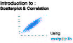
If we want to inspect the relationship between two numeric variables, the standard choice of plot is the scatterplot. In a …

Data Viz   •   11 May 2020   •   4 min read
Introduction to Histogram

Introduction to Histogram

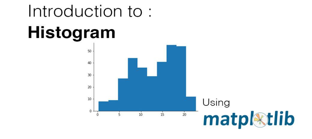
A histogram is used to plot the distribution of a numeric variable. It’s the quantitative version of the bar chart. However, rather …

Data Viz   •   1 May 2020   •   8 min read
Introduction to Pie Chart

Introduction to Pie Chart

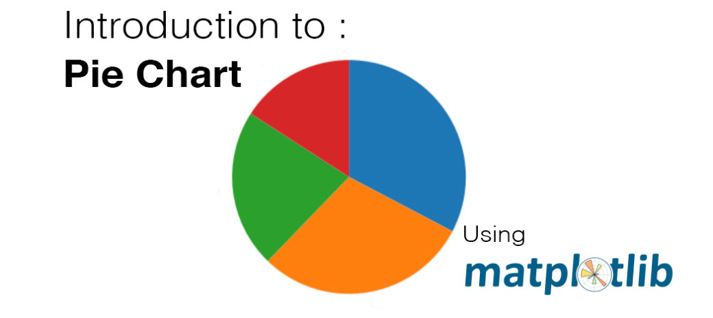
A pie chart is a common univariate plot type that is used to depict relative frequencies for levels of a categorical variable. …

Data Viz   •   22 April 2020   •   5 min read
How to Get Colorblind-Friendly Data Visualizations

How to Get Colorblind-Friendly Data Visualizations

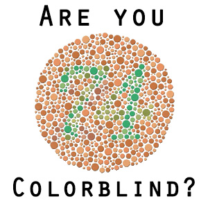
Humans perceive color through signals produced by cells in the retina called cones. Light comes into the eye, hits the …

Data Viz   •   9 April 2020   •   1 min read
What's Wrong with this Apple Keynote Pie Chart

What’s Wrong with this Apple Keynote Pie Chart

On June 9, 2008, Steve Jobs took the stage in San Francisco to unveil the new iPhone.As he presented the …

Data Viz   •   1 April 2020   •   1 min read
Design Integrity : The Lie Factor

Design Integrity : The Lie Factor

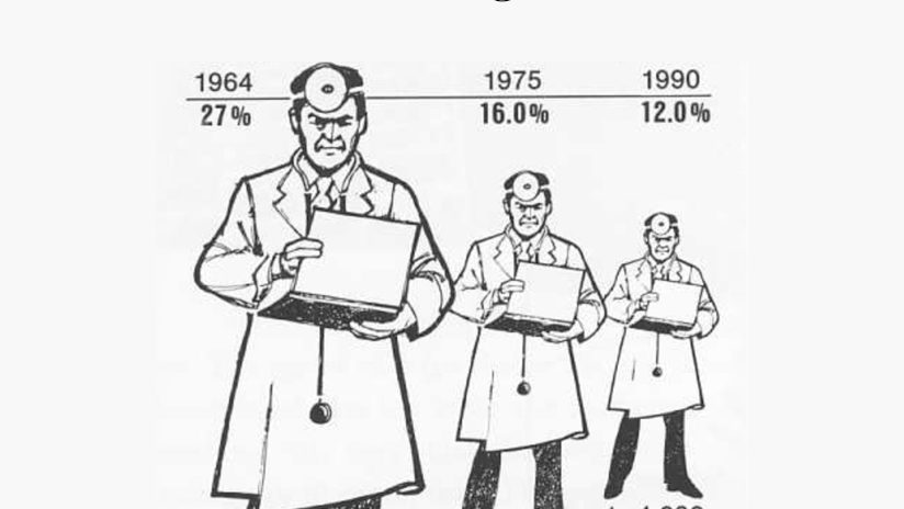
It is key that when you build plots you maintain integrity for the underlying data. One of the main ways …

Data Viz   •   21 March 2020   •   1 min read

Committed to Produce Quality Content

Powered by Mathieu Rella