


Humans perceive color through signals produced by cells in the retina called cones.

Light comes into the eye, hits the cones and the cones set off electrical signals to the brain. There are typically three types of cones : S (short), M (medium) and L (long).
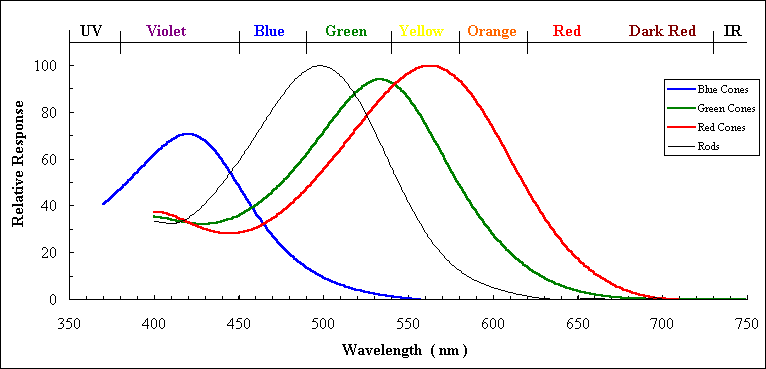
They are sensitive to different frequencies or colors of light.
- Short cones prefer Blue
- Medium cones prefer Green
- Long cones prefer Red
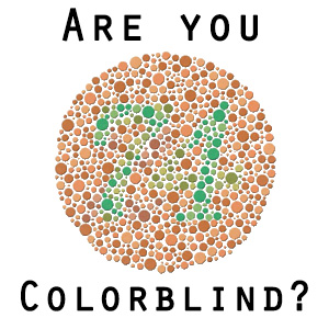
However around 10% of men and 1% of women have mutations that affect these cones and produce what is know as colorblindness.
The most common form is a red green colorblindness, typically caused by the medium cone shifting sensitivity towards red light.
People with this condition can’t distinguish between red and green, as show in this image of red and green apple :

There is actually a pretty large fraction of people that are colorblind. So we as Data Analyst / Scientist should design our visualizations to include them.
To be sensitive to those with colorblindness, we should use color palettes that do not move from red to green without using another element to distinguish this change like shape, position, or lightness.
Both of these colors appear in a yellow tint to individuals with the most common types of colorblindness. Instead, use colors on a blue to orange palette.


Wow thanks a lot, just what i needed to make mine more inclusive
great tips thanks
thanks for the advice let’s put this into work 😉