


If we want to inspect the relationship between two numeric variables, the standard choice of plot is the scatterplot. In a scatterplot, each data point is plotted individually as a point, its x-position corresponding to one feature value and its y-position corresponding to the second. One basic way of creating a scatterplot is through Matplotlib’s scatter function:
plt.scatter(data = df, x = 'num_var1', y = 'num_var2')
We can see a generally positive relationship between the two variables, as higher values of the x-axis variable are associated with greatly increasing values of the variable plotted on the y-axis.
One point is usually plotted for every observation we have in our data resulting in a cloud of points.
The pattern in the cloud of points can clearly showwhat kind of relationship exist between our 2 variables and it’s strenght. We are often interested in quantifying the strenght of the relationship between two variables through a correlation coefficient.
Pearson Correlation
The most commonly used is the Pearson correlation coefficient (annoted r), here is a quick overview of this coefficient
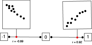
The statistic take a value between -1 and 1.
Positive number indicate relationship where positive changes of 1 variable is associated of a positive change in the second variable.

While negative r numbers indicate that when one variable increase, the second variable tends to decreased.

Value closes to the extremes of negative one or one indicates a stronger, more predictable relationship while value close to zero indicate a weaker relationship.

Finally the Pearson correlation only capture linear relationship.
Alternative Approach
Seaborn’s regplot function combines scatterplot creation with regression function fitting:
sb.regplot(data = df, x = 'num_var1', y = 'num_var2')The basic function parameters, “data”, “x”, and “y” are the same for regplot as they are for matplotlib’s scatter.

By default, the regression function is linear, and includes a shaded confidence region for the regression estimate. In this case, since the trend looks like a log(y)∝x relationship (that is, linear increases in the value of x are associated with linear increases in the log of y), plotting the regression line on the raw units is not appropriate. If we don’t care about the regression line, then we could set fit_reg = False in the regplot function call. Otherwise, if we want to plot the regression line on the observed relationship in the data, we need to transform the data.
def log_trans(x, inverse = False):
    if not inverse:
        return np.log10(x)
    else:
        return np.power(10, x)

sb.regplot(df['num_var1'], df['num_var2'].apply(log_trans))
tick_locs = [10, 20, 50, 100, 200, 500]
plt.yticks(log_trans(tick_locs), tick_locs)
In this example, the x- and y- values sent to regplot are set directly as Series, extracted from the dataframe.


Great and concise intro to scatter plot thanks dude
Very interesting information
Thank you very much for the information
Thanks for the valuable information
Interesting information thanks mat